March 1, 2024
A Guide to Evaluating Data
Data analysis and interpretation have taken center stage with the advent of the digital age... and the sheer volume of data can be terrifying. According to a study by Digital Universe, the total data volume in 2012 amounted to 2.8 trillion gigabytes! Based on this amount of data alone, it is clear that the ability to analyze complex data, gain actionable insights, and adapt to new market requirements will be the calling card of every successful company in today's global world – and all in the quick of thought.

Data analysis and interpretation have taken center stage with the advent of the digital age... and the sheer volume of data can be terrifying. According to a study by Digital Universe, the total data volume in 2012 amounted to 2.8 trillion gigabytes! Based on this amount of data alone, it is clear that the ability to analyze complex data, gain actionable insights, and adapt to new market requirements will be the calling card of every successful company in today's global world – and all in the quick of thought.
Business dashboards are the tools of the digital age for big data. They are able to present key performance indicators (KPIs) for both quantitative and qualitative data analyses and are ideal for the rapid and data-driven market decisions that lead today's industry leaders to sustainable success. Through the art of streamlined visual communication, data dashboards enable companies to make informed decisions in real time and are important tools for data interpretation. Let us first find a definition to understand what lies behind the meaning of data evaluation conceals.
What is Data Evaluation?
Data interpretation is the process in which various analytical methods are used to verify data and reach relevant conclusions. Interpreting data helps researchers categorize, edit, and summarize the information to answer critical questions.
The importance of data interpretation is obvious and must therefore be carried out correctly. It is very likely that the data comes from various sources and goes into the analysis process in an arbitrary order. Data analysis tends to be extremely subjective. This means that the nature and goal of interpretation differ from company to company, which is likely related to the type of data being analyzed. While there are different types of methods that are used depending on the type of data, the two most widely used categories are “quantitative analysis” and “qualitative analysis.”
However, before a serious investigation of data evaluation can begin, you should be aware that the visual presentation of the data results is irrelevant as long as no well-founded decision has been made about the measurement scales. Before serious data analysis can begin, the measurement scale for the data must be defined, as this has long-term effects on the profitability of data analysis. The various scales include:
Nominal scale: Non-numeric categories that cannot be quantitatively classified or compared. The variables are exclusive and exhaustive.
Ordinal scale: Exclusive categories that are exclusive and exhaustive but have a logical order. Quality ratings and approval ratings are examples of ordinal scales (i.e. good, very good, mediocre, etc. OR agree, strongly agree, disagree, etc.).
Interval: a measurement scale in which data is grouped into categories with ordered and equal distances between categories. There is always an arbitrary zero point.
Ratio: Includes characteristics from all three categories.
How Can you Evaluate Data?
When interpreting data, an analyst must try to identify the differences between correlation, causality, and coincidences, as well as many other biases — but he must also consider any factors involved that could have led to a result. There are various methods of data interpretation that can be used.
Interpreting data should help people understand numerical data that has been collected, analyzed, and presented. A basic method (or methods) for interpreting data provides your analytics teams with a structure and a consistent basis. This is because when multiple departments take different approaches to interpreting the same data, even though they have the same goals, there can be a discrepancy between the goals. Different methods lead to duplication of work, inconsistent solutions, wasted energy and, inevitably, wasted time and money. In this part, we will look at the two most important methods of data evaluation: qualitative and quantitative analysis.
Qualitative Data Evaluation
The qualitative data analysis can be summarized in one word: categorical. In qualitative analysis, the data is described not by numeric values or patterns, but by using descriptive context (i.e. text). Typically, narrative data is collected from person to person through the use of a variety of techniques. These techniques include:
Observations: Recording of behavioral patterns that occur within an observation group. These patterns can include the amount of time spent with an activity, the type of activity, and the type of communication.
Focus groups: Group people and ask them relevant questions to encourage collaborative discussion on a research topic.
Secondary research: Similar to how patterns of behavior can be observed, various types of documentation resources can be coded and subdivided according to the type of material they contain.
Interviews: one of the best methods for collecting narrative data. Respondents' answers can be grouped by topics, topics, or categories. The interview approach enables highly focused data segmentation.
A significant difference between qualitative and quantitative analysis is clearly visible in the interpretation phase. Qualitative data is highly interpretable and must be “coded” to make it easier to group and label the data into identifiable topics. Because person-to-person data collection techniques can often lead to disputes about the correct analysis, qualitative data analysis is often summarized in three basic principles: perceive things, collect things, think about things.
Quantitative Data Evaluation
If you could summarize the interpretation of quantitative data in one word (and you really can't), that word would be “numeric.” There are few certainties when it comes to data analysis, but you can be sure that it isn't quantitative research if the research you're involved in doesn't include numbers. Quantitative analysis refers to a set of methods used to analyze numerical data. This usually involves the use of statistical models such as standard deviation, mean and median. Let's briefly review the most common statistical terms:
Mean: The mean represents a numeric average for a set of answers. If it is a data set (or multiple records), the mean represents a central value of a specific set of numbers. It is the sum of the values divided by the number of values within the data set. Other terms that can be used to describe this concept include arithmetic mean, average, and mathematical expectation.
Standard deviation: This is another statistical term that is common in quantitative analysis. The standard deviation provides information about the distribution of responses around the mean. It describes the degree of consistency within the answers; together with the mean, it provides information about the data sets.
Frequency distribution: This is a measure of how often a response appears in a data set. For example, in a survey, the frequency distribution can determine the frequency of occurrence of a particular answer on an ordinal scale (e.g. agree, completely agree, disagree, etc.). The frequency distribution is extremely helpful in determining the degree of agreement between data points.
Quantitative data is usually measured by visually presenting correlation tests between two or more significant variables. Different methods can be used together or separately, and comparisons can be made to ultimately reach a conclusion. Other characteristic interpretation methods for quantitative data include:
Regression analysis: Essentially, regression analysis uses historical data to understand the relationship between a dependent variable and one or more independent variables. When you know which variables are interrelated and how they've developed in the past, you can anticipate potential outcomes and make better decisions for the future. For example, if you want to predict your sales for the next month, you can use regression analysis to understand what factors will impact sales, such as selling products, launching a new campaign, and more.
Cohort analysis: This method is used to identify groups of users who share common characteristics over a specific period of time. In a business scenario, cohort analysis is typically used to understand various customer behaviors. For example, a cohort could be all users who signed up for a free trial on a specific day. It analyses how these users behave, what actions they perform and how their behavior differs from that of other user groups.
Predictive analysis: As the name suggests, the predictive analysis method aims to predict future developments by analyzing historical and current data. With the help of technologies such as artificial intelligence and machine learning, companies can use predictive analysis to identify trends or potential problems and plan well-founded strategies in advance.
Prescriptive analysis: Prescriptive analysis, which is also based on predictions, uses techniques such as graph analysis, complex event processing, and neural networks to identify the effects of future decisions and adjust them before they are actually made. This helps companies develop responsive, practical business strategies.
Conjoint analysis: The conjoint approach is usually used when analyzing surveys to analyze how individuals rate various attributes of a product or service. This helps researchers and companies set prices, product features, packaging, and many other features. One common use is menu-based conjoint analysis, which gives people a “menu” of options from which they can put together their ideal concept or product. This allows analysts to understand which attributes they would prefer over others and draw conclusions from them.
Cluster analysis: Last but not least, cluster analysis is a way to group objects into categories. Because cluster analysis doesn't have a target variable, it's a useful way to find hidden trends and patterns in the data. In a business context, clustering is used to segment audiences to create targeted experiences, and in market research, it is often used to identify age groups, geographic information, income, etc.
Now that we've seen how to interpret data, let's ask ourselves a few questions: What are the benefits of data interpretation? Why are all industries engaged in data research and analysis? These are fundamental questions, but they are often not given enough attention.
Why is Data Evaluation so Important?
The purpose of data collection and evaluation is to obtain useful and usable information and to make decisions that are as well-founded as possible. From companies to newlywed couples exploring their first home, data collection and interpretation offers limitless benefits for a wide range of institutions and individuals.
Regardless of method and qualitative/quantitative status, data analysis and interpretation may have the following characteristics:
- Identifying and explaining data
- Comparing and contrasting data
- Identifying data outliers
- Predictions for the future
Data analysis and interpretation ultimately help to improve processes and identify problems. Without a minimum level of data collection and evaluation, it is difficult to grow and achieve reliable improvements. What is the key word? Reliably There are vague ideas of performance improvement in all institutions and industries. But without proper research and analysis, an idea is likely to remain in a stagnant state forever (i.e. minimal growth). So what are some of the business benefits of analyzing and interpreting data in the digital age? Let's have a look!
1) Well-founded decision making: A decision is only as good as the knowledge on which it is based. Sound decision-making based on data has the potential to differentiate industry leaders from the rest of the market. Studies have shown that companies in the top third of their industry are on average 5% more productive and 6% more profitable when they use well-founded data decision-making processes. Most decisive measures only arise after a problem has been identified or a goal has been defined. Data analysis should include identification, thesis development, and data collection, followed by data communication.
If institutions just follow this simple order, which should be familiar to all of us from elementary school science fairs, then they will be able to solve problems when they arise in real time. Informed decision making tends to be cyclical. This means that there is actually no end and that new questions and conditions arise in the course of the process, which must be further investigated. Monitoring data results will inevitably result in the process returning to the beginning with new data and perspectives.
2) Predictive needs assessment with the identification of trends: Data insights provide knowledge, and knowledge is power. The insights gained from analyzing market and consumer data have the ability to set trends for other companies in similar market segments. A perfect example of how data analysis can impact trend forecasting is the music recognition application Shazam. The application allows users to upload an audio clip of a song they like but don't seem to identify. 15 million songs are identified by users every day. With this data, Shazam has helped predict future popular artists.
When industry trends are identified, they can serve a larger industry purpose. The findings from Shazam monitoring not only help Shazam meet consumers' needs, but also give music managers and record labels an insight into the current pop culture scene. Data collection and interpretation processes can enable industry-wide climate forecasting and lead to larger revenue streams across the market. For this reason, all institutions should follow the basic data cycle of collection, interpretation, decision making, and monitoring.
3) Cost efficiency: The proper implementation of data analysis procedures can provide companies in their industry with profound cost advantages. A recent data study by Deloitte vividly demonstrates this by finding that the ROI of data analysis is determined by efficient cost reductions. This advantage is often overlooked because making money is generally seen as “more attractive” than saving money. However, robust data analytics are able to alert management to opportunities to reduce costs without significant human capital expenditure.
A great example of the potential for cost efficiency through data analysis is Intel. Prior to 2012, Intel carried out more than 19,000 functional tests on its chips before they could be approved for approval. To reduce costs and reduce testing time, Intel introduced predictive data analytics. By using historical and current data, Intel now avoids testing each chip 19,000 times by focusing on specific and individual chip tests. Following the launch in 2012, Intel saved over $3 million in manufacturing costs. Cutting costs may not be as “sexy” as data gains, but as Intel proves, this is a benefit of data analysis that shouldn't be neglected.
4) A clear view of the future: Companies that collect and analyze their data gain better insights about themselves, their processes, and their performance. They can identify performance challenges when they arise and take action to overcome them. Interpreting data through visual representations enables them to process their insights faster and make more informed decisions about the future of the company.
Common Problems With Data Analysis and Interpretation
The oft-repeated mantra of those who are afraid of data advances in the digital age is: “Big data equals big problems.” Even though this statement is not true, it is safe to say that there are certain problems with data interpretation or “pitfalls” and can arise when analyzing data, particularly with the speed of thinking. Here are some of the most common risks of misinterpreting data and how they can be avoided:
1) Confusing correlation with causality: Our first misinterpretation of data relates to the tendency of data analysts to confuse the cause of a phenomenon with correlation. It is the assumption that two acts occurred together and one caused the other. This is incorrect because actions can occur together without a cause and effect relationship.
An example from the digital age: If you assume that higher sales are the result of a larger number of followers on social media, there could be a clear correlation between the two, particularly in today's multi-channel buying experiences. However, this does not mean that an increase in followers is the direct cause of higher earnings. There could be both a common cause and an indirect causality.
Remedy: Try to eliminate the variable that you think is causing the phenomenon.
2) Confirmation bias: Our second data interpretation problem occurs when you have a theory or hypothesis in mind but just want to discover data patterns that support that theory or hypothesis while you discard the ones that don't.
Example from the digital age: Your boss asks you to analyze the success of a recent cross-platform social media marketing campaign. When analyzing potential data variables from the campaign (which you ran and think went well), you found that the share rate for Facebook posts was high, but the share rate for Twitter tweets wasn't. If you just use the Facebook posts as proof of your hypothesis that the campaign was successful, that would be a perfect manifestation of confirmation fallacies.
Remedy: Since this pitfall is often based on subjective wishes, one remedy would be to analyze the data with a team of objective people. If that's not possible, another solution is to resist the urge to draw a conclusion before the data investigation is complete. Remember that you should always try to disprove a hypothesis, not prove it.
3) Irrelevant data: The third case of misinterpretation of data is particularly important in the digital age. Since large amounts of data are no longer stored centrally and continue to analyze them at the speed of thought, it is inevitable that analysts will focus on data that is irrelevant to the problem they're trying to solve.
Example from the digital age: When you try to measure the success of a lead generation email campaign, you find that the number of homepage views directly attributable to the campaign has increased, but not the number of monthly newsletter subscribers. Based on the number of homepage views, you decide that the campaign was a success when it actually didn't generate any leads.
Remedy: Proactively and clearly set all data analysis variables and KPIs before you perform a data review. If you measure the success of a lead generation campaign by the number of newsletter subscribers, there's no need to check the number of homepage visits. Make sure you focus on the data variable that answers your question or solves your problem, not irrelevant data.
4) Cut off the axes: When you create a graph to start interpreting the results of your analysis, it's important to keep the axes true and avoid misleading visualizations. If you start the axes with a value that does not reflect the actual truth about the data, this may lead to incorrect conclusions.
Example for the digital age: In the following image, we see a chart from Fox News where the Y-axes start at 34%, which makes it appear that the difference between 35% and 39.6% is much larger than it actually is. This could lead to a misinterpretation of tax rate changes.
5) (Small) sample size: Another common problem in data analysis and interpretation is the use of a small sample size. Logically, the larger the sample size, the more accurate and reliable the results are. However, this also depends on the size of the study's effect. For example, for a survey about the quality of education, the sample size will not be the same as for a survey of people who play outdoor sports in a specific area.
Example of the digital age: Imagine you ask 30 people a question and 29 answer “yes,” which is 95% of the total number. Now imagine asking the same question to 1000 people and 950 of them answering “yes,” which in turn represents 95%. While these percentages look the same, they don't mean the same, because a sample of 30 people is not meaningful enough to draw a truthful conclusion.
Remedy: In order to determine the correct sample size for truthful and meaningful results, a margin of error must be established that indicates the maximum deviation of the results from the statistical mean, according to the researchers. In parallel, a confidence level must be set, which should be between 90 and 99%. With these two values in hand, researchers can calculate an exact sample size for their studies.
6) Reliability, Subjectivity, and Generalizability: When carrying out a qualitative analysis, researchers must consider practical and theoretical limitations when interpreting the data. In some cases, qualitative research may be considered unreliable due to uncontrolled factors that may or may not influence the results. In addition, the researcher plays the main role in the process of interpretation, i.e. he or she decides what is relevant and what is not, and as we know, interpretations can be very subjective.
Generalizability is also a problem that researchers are confronted with during qualitative analysis. As mentioned in the point about the small sample size, it is difficult to draw conclusions that are 100% representative because the results may be biased or not representative of a larger population.
These factors occur primarily in qualitative research, but can also have an impact on quantitative analysis. For example, when choosing which KPIs to present and how they are presented, analysts can also be biased and present them in a way that benefits their analysis.
Example of the digital age: Distorted questions in a survey are a good example of problems with reliability and subjectivity. Imagine sending out a survey to your customers to find out how satisfied they are with your customer service and ask the question: “How great was your experience with our customer service team?” Here we can see that this question clearly influences the individual's answer by adding the word “amazing.”
Remedy: One solution to avoid these issues is to keep your research honest and neutral. Keep the wording of questions as objective as possible. For example, “How satisfied were you with our customer service on a scale of 1-10.” This doesn't entice the respondent to answer a specific answer, so the results of your survey are reliable.
Techniques and Methods of Data Evaluation
Data analysis and interpretation are critical when it comes to drawing informed conclusions and making better-informed decisions. As we've seen in this article, interpreting data is both an art and a science. To help you with that, we'll list some relevant data interpretation techniques, methods, and tricks that you can use for a successful data management process be able to use.
As mentioned at the beginning of this post, the first step to successful data interpretation is to determine the type of analysis you want to perform and apply the appropriate methods. Make a clear distinction between qualitative analysis (observe, document and interview, collect and think about things) and quantitative analysis (you conduct research with lots of numerical data to be analyzed using various statistical methods).
1) Ask the Right Questions About Data Analysis
The first technique of data evaluation is to define a clear starting point for your work. This can be done by answering a few critical questions that serve as a useful guide to get you started. This includes: What goals am I pursuing with my analysis? What type of data analysis method will I use? Who will use this data in the future? And above all: Which general question do I want to answer?
Once all of this information is set, you can start collecting data. As stated at the beginning of the post, the methods of data collection depend on what type of analysis you use (qualitative or quantitative). When you have all the information you need, you can start evaluating, but first you need to visualize your data.
2) Use the Right Type of Data Visualization
Data visualizations such as business graphics, charts, and tables are essential for successful data interpretation. This is because visualizing data through interactive charts and graphics makes the information easier to understand and more accessible. As you may know, there are different types of visualizations that you can use, but not all are suitable for every analysis purpose. Using the wrong chart can lead to a misinterpretation of your data, which is why it's very important to choose the right visualization for it. Let's look at some use cases for common data visualizations.
Bar chart: The bar chart is one of the most commonly used chart types and uses rectangular bars to represent the relationship between 2 or more variables. There are various types of bar charts for different interpretations, including the horizontal bar chart, the column chart, and the stacked bar chart.
Line chart: The line chart is most commonly used to represent trends, acceleration or deceleration, and volatility and is intended to show how the data changes over a specific period of time, such as sales figures over a year. A few tips for keeping this chart interpretable are to avoid using too many variables that could clutter the chart and keep the axis scale close to the highest data point so that the information isn't difficult to read.
Pie chart: Although this chart doesn't contribute much to the analysis due to its simplicity, pie charts are often used to represent the proportional composition of a variable. Visually speaking, representing a percentage in a bar chart is much more complicated than in a pie chart. However, it also depends on the number of variables you're comparing. If your pie chart needs to be divided into 10 parts, it's better to use a bar chart.
Tables: While they're not a specific type of chart, tables are commonly used when interpreting data. Tables are particularly useful when you want to display data in its raw format. They give you the freedom to easily look up or compare individual values and display totals at the same time.
As the use of data visualizations is becoming increasingly important for the analytical success of companies, many tools have emerged to help users visualize their data in a coherent and interactive way. One of the most popular tools is to use BI dashboards. These visual tools provide a central view of various graphs and charts that paint a bigger picture of a topic. In the next part of this article, we will learn more about the power of dashboards for efficient data evaluation practice. If you'd like to learn more about different types of data visualizations, take a look at our full guide on the subject.
3) Stay Objective When Interpreting
As mentioned earlier, it is fundamental that you remain objective in your interpretation. As the person who is closest to the investigation, you can easily become subjective when looking for answers in the data. A good way to remain objective is to show the information to other people involved with the study, such as research partners or even the people who will use your results once they're done. This can help prevent confirmation errors and problems with the reliability of your interpretation.
4) Mark Your Findings and Draw Conclusions
Findings are the observations that you have obtained from your data. They are the facts that will help you draw deeper conclusions about your research. For example, the insights could include trends and patterns that you discovered during the interpretation process. To put your findings in perspective, you can compare them with other sources that have used similar methods and use them as benchmarks.
Reflect on your own thinking and reasoning and be aware of the many pitfalls of data analysis and interpretation. Correlation versus causality, subjective bias, incorrect information, and inaccurate data, etc. Once you're satisfied with your interpretation of the data, you can draw conclusions, check whether your original question was answered, and make recommendations based on that.
Interpreting data: Using dashboards to bridge the gap
As we have seen, quantitative and qualitative methods are different types of data analysis. Both offer different levels of return on investment (ROI) when studying, auditing, and making decisions about data. Because of these differences, it is important to understand how dashboards can be used to bridge the gap between quantitative and qualitative information. How do digital data dashboard solutions play a key role in bridging the data gap? Here are a few of the options:
1) Linking and merging data. With today's pace of innovation, it is no longer possible (nor desirable) to store mass data centrally. With the ongoing globalization of companies and the dissolution of borders, it is becoming increasingly important for companies to be able to carry out various data analyses regardless of their location. Data dashboards decentralize data without sacrificing the necessary speed of thinking and combine both quantitative and qualitative data. Whether you want to measure customer trends or business performance, you can now do both without having to limit yourself to a single selection.
2) Mobile data. The term “linked and mixed data” is associated with the term mobile data. In today's digital world, employees spend less time at their desks and increase production at the same time. This is made possible by the fact that mobile solutions for analysis tools are no longer independent. Today, mobile analytics applications fit seamlessly into everyday business tools. In return, quantitative and qualitative data is available on demand via interactive online dashboards where, when and how it is needed.
3) Visualization. Data dashboards bridge the data gap between qualitative and quantitative methods of data interpretation through the science of visualization. Dashboard solutions are well-equipped “out of the box” to create easy-to-understand data demonstrations. Modern online data visualization tools offer a variety of color and filter patterns, encourage user interaction, and are designed to improve the predictability of future trends. All of these visual features make it easy to switch between data methods – you just need to find the right types of data visualization to best tell your data story.
To give you an idea of how a market research dashboard meets the need to combine quantitative and qualitative analysis and understand how to interpret data in research thanks to visualization, take a look at the example below. It combines both qualitative and quantitative data that has been expertly analyzed and visualizes it in a meaningful way that is understandable to everyone, so that every viewer is able to interpret it.
Strategic Advisory & Effective Execution
We continuously innovate to transform data into competitive advantage via expert advisory, effective project execution, and precision engineering.
.svg)
Our Blog for Experts.
We use our expertise in various disciplines to turn data into sustainable competitive advantages for our customers and to share our knowledge.
.png)
.png)
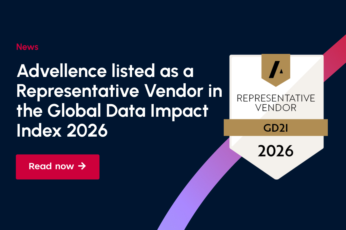
Further News
All the latest news about Advellence